New Talent
- Firstname/Profession
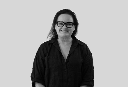
- Shelley
- Mac Operator / Retoucher
- Specialties
- Layout, Retouching, Mac Operation, Finished Art, Design Direction, File Management, Artworking, Annual Reports
- Auckland
-
 82
82
Represented: 13/03/24
- Firstname/Profession
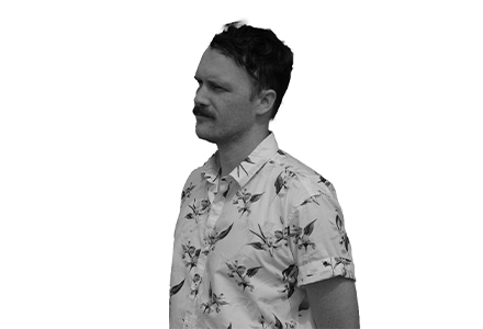
- Byron
- Motion Designer / Film & Content Editor
- Specialties
- Editing, 2D Animation, 3D Animation, Motion Graphic Design, Art Direction
- Christchurch
-
49
Represented: 21/03/24
Creative Talent
- Firstname/Profession
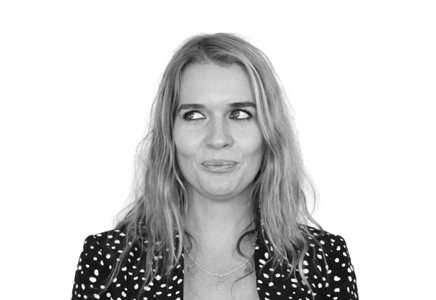
- Melissa
- Art Director / Creative Director
- Specialties
- Creative Direction, Advertising, Copywriting, Art Direction, Brand Activation, Concepting, Campaign Management, Ideation
- Auckland, Christchurch, Wellington
-
14154
Represented: 15/05/14
- Firstname/Profession
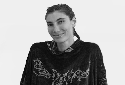
- Elise
- Graphic & Brand Designer / Illustrator
- Specialties
- Graphic Design, Brand Identity, Logo Design, Illustration, Advertising, Digital Design, Layout, Photography
- Hamilton, Auckland
-
1128
Represented: 19/12/22
Digital Talent
- Firstname/Profession
- Jason
- Digital & UI Designer / Art Director
- Specialties
- Digital Design, Art Direction, UI Design, Photography, Creative Direction, Web Development, Application Development, Storyboarding
- Auckland
-
688
Represented: 27/01/23
- Firstname/Profession
- Greg
- UX Designer / Digital & UI Designer
- Specialties
- Stakeholder Management, UX Design, Workshops, Art Direction, Interaction Design, Project Management, User Journeys
- Christchurch
-
999
Represented: 22/11/23
Marketing Talent
- Firstname/Profession
- Kelsey
- Digital Marketing Specialist
- Specialties
- Project Management, E-commerce, Digital Strategy, Campaign Management, Marketing Communication, Marketing Strategy, Social Media Marketing, Social Media Strategy
- Auckland
-
3681
Represented: 13/10/20
- Firstname/Profession
- Ash
- Digital Marketing Specialist
- Specialties
- Social Media Strategy, Creative Direction, Concepting, Social Media Marketing, Producing, Editing
- Auckland
-
1304
Represented: 12/04/23