- Firstname/Profession
- Greg
- UX Designer / Digital & UI Designer
- 12 Plus years Experience
- Christchurch
-
 1629
1629
Represented: 22/11/23
HERE Indoor Maps
About Project
For two years I was responsible for the user experience of indoor maps at HERE. From within a horizontal design team, I worked with application teams to design how indoor maps can be integrated in their apps, and worked with the indoor team to make improvements to how indoor maps work.
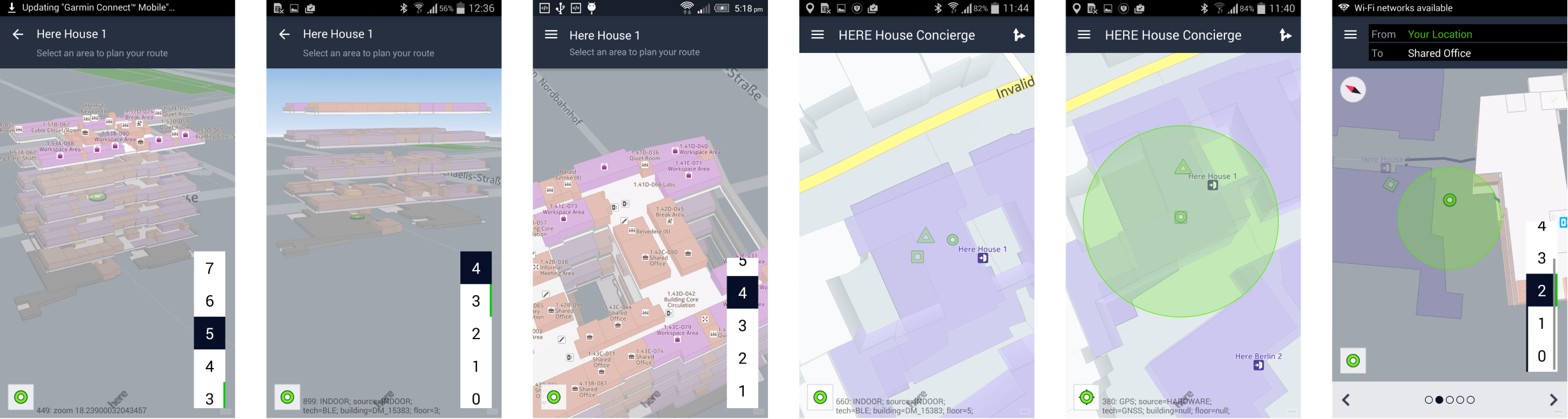
During this time, the indoor team was working on technology that would enable positioning and routing indoors. In this particular project, I worked on a demo app to prototype and validate how well the technology performed in the real world.
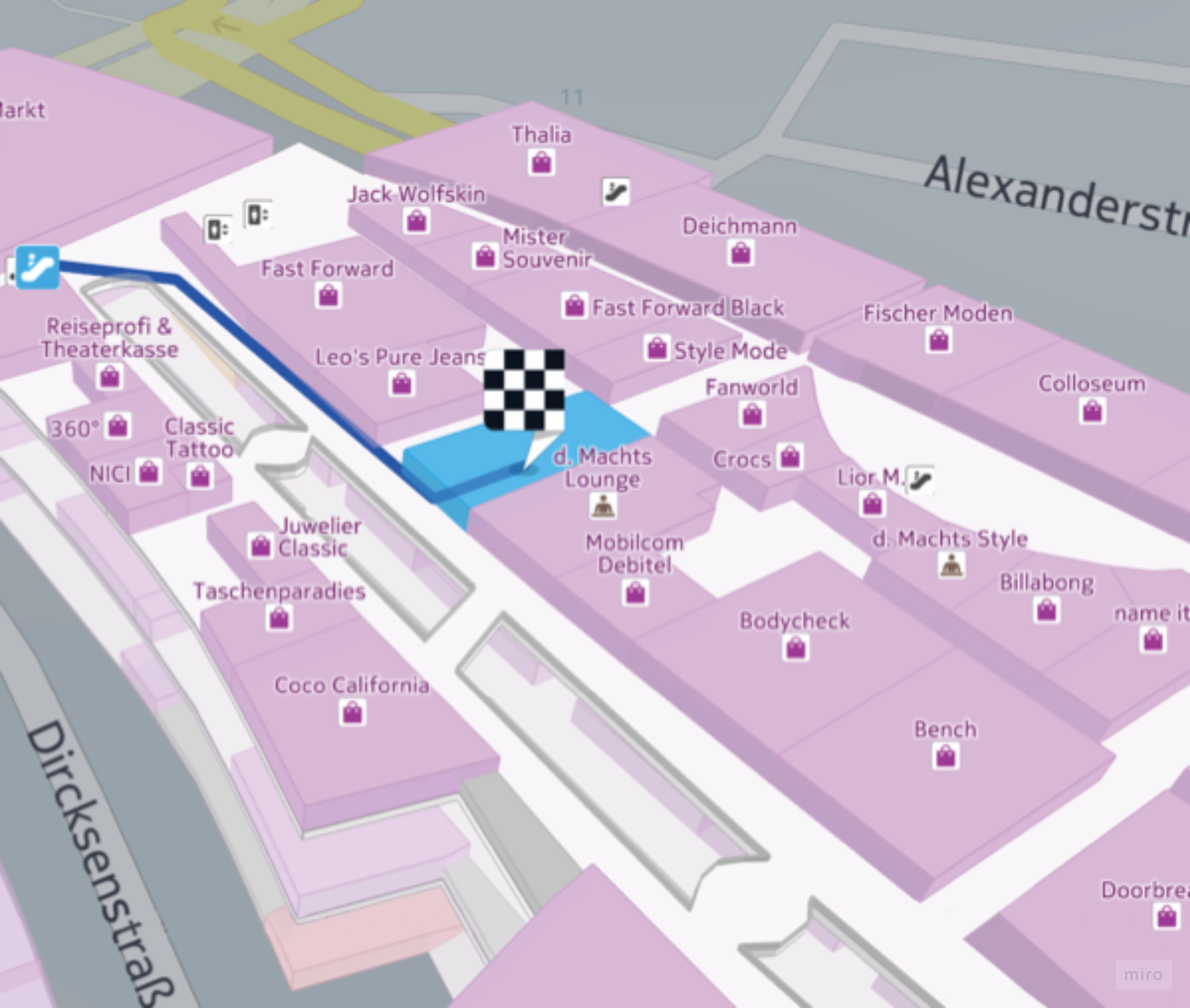
Navigating inside an unfamiliar building is difficult. Indoor environments lack the familiar landmarks that help people orientate outdoors – such distinctive buildings, street signage, parks, and stations. Without the usual orientation cues we rely on outdoors, it’s sometimes easy to get lost or overshoot the destination.
At HERE, our indoor positioning service involved two main enablers, developed by separate teams. We wanted to evaluate how well these enablers worked together for a few key scenarios:
orientating indoors
transitioning between floors
navigating to an indoor destination
We briefed the research team with 3 hypotheses in mind:
Different map views are required for positioning, previewing a route, and navigation.
Our current map is not making the best use of 3D perspective
Better positioning accuracy is needed for reliable navigation
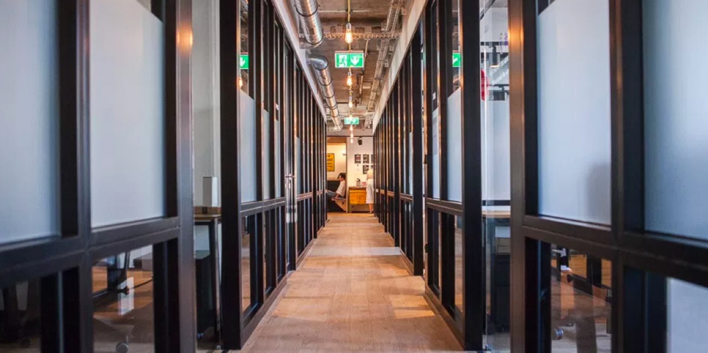
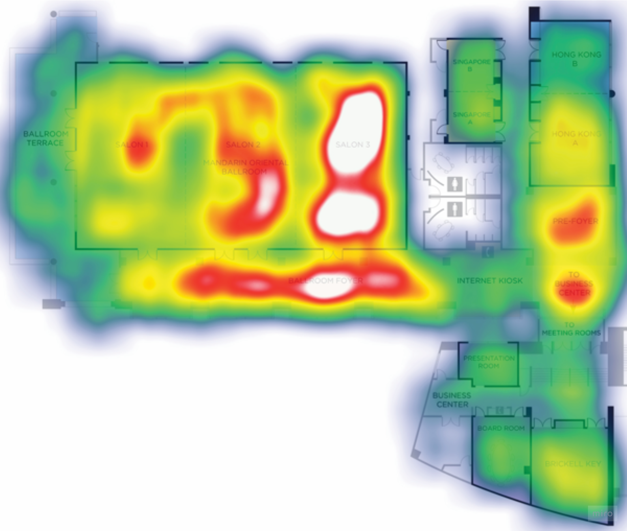
Realistics scenarios and a script were developed with more detailed questions for each part of the journey. Testing was carried out in the HERE offices with 5 participants.
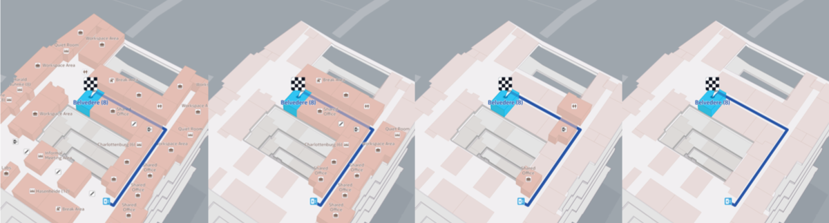
Designing the ideal indoor navigation map
The new renderer allowed the indoor layouts to be shown in 3D, with each level stacked on top of one another. In theory this could allow users to get a better mental model of a journey between floors. This tilted map view also added more detail though. From research, we knew that navigation indoors relied on a corridor of references. We wanted to know which cues actually helped when navigating in an office environment? Which could we remove?
I created a small prototype which allowed participants to create their ideal navigation view. If you like, you can try it out yourself.
We presented the research results to indoor product and engineering management, indicating where experience improvements were needed. The results were used to prioritise improvements on the indoor roadmap and also to request support from other teams.
The feedback from developers showed that further alignment was needed between the positioning and rendering APIs.
The indoor team has since made improvements to positioning and the product was later used commercially in a Smart Office product product.
Industries
Technology
Specialties
Interaction Design, Project Management, User Journeys
Client
HERE